Tuesday, 4 May 2010

Two new pieces! The last two of my 2nd year project.

So here they are, in all their... well here they are anyway, this is the second to last one I did, and I am really happy with it. The idea behind it is Cinderella in despair at her existence, her dark, tortured life looming over her head, her broken home shattered below.


So, house paint base coat, with a house paint and black and white ink merging of media in the face, just inks around the top and bottom; roughly 8"x5" in size, a good size piece, painted on loose canvas.
Here is the latest one that I have done, definately my favourite along side the above piece also...


According to my rough calculations this is also 8"x5", a good round favourite size of mine to work on, and it is painted with a household paint background, black and white inks for the foreground aswell as bleach hints; painted on loose canvas.


And as promised! Here is my work space, this is where I produced my work for this year (it used to be completely white walls and grey floor - BORING!), it is a place that I have tried to spruce up haha.

Mmm orange juice with bits (NOT FROM CONCENTRATE.) and some lovely colours. You can kind of see the different sizes of pieces that I've done on the wall to left, centre, and kind of to the far right of the image aswell.


Doesn't that look lovely? Everyone should have their own I say, give it a go.

Thursday, 22 April 2010

Title rant and new piece huzzah

Ok so here's a new update. This is the most recent piece I have created, it's a piece based on Cinderella and her 'broken home', hence the er, falling down building. Anyway, I almost put a title here for the piece, but I just find them pretentious, or ambiguous to the point of disgust. I'm certainly not saying I haven't put a title on a piece of work before, thought I'd try it out, but I felt a bit sick afterwards.
Imagine this conversation - "Hey, so what's your piece called?" "The Smelting of Dante's Soul" "Great, sounds deep" "Yeah. Urgh."
I could've made it sound less 'powerful' or less 'spiritual' but hey, it represented what I'd actually painted, however there is a problem there-in; the fact that I had given the name implies something, I had dishevelled the mystique of the piece, thrown up a wall so a peep whole represented all the possibilities the piece could be about, instead of amalgamating any thoughts the viewer might have. Why take that away from the viewer? Infact, why would you not want to embrace a viewers opinions, thoughts and possible insanity, whatever they can get from your piece, let them do it justice in their own mind, do not take that away from them. That is when injustice ensues. Either that or they just hated it from the start, but atleast this way you give them a chance.
NO TITLES, NO IMPOSSIBILITIES. And no, I do not want you to put upon the wall "Untitled 1" - THAT IS A TITLE, JUST BY NAMING IT AS UNTITLED, YOU'VE GIVEN IT THE NAME OF 'UNTITLED 1' YOU IDIOT. IT HAS NO TITLE, DON'T GIVE IT A TITLE, THAT'S MY DECISION.
Rant, over.

So here's the piece -


I'd suggest this is around 3"6 by 4" so not all that large in size - I've thrown up a massive canvas in place of this now however - it's loose canvas pinned to the wall, house paint base coat with ink and bleach foreground.

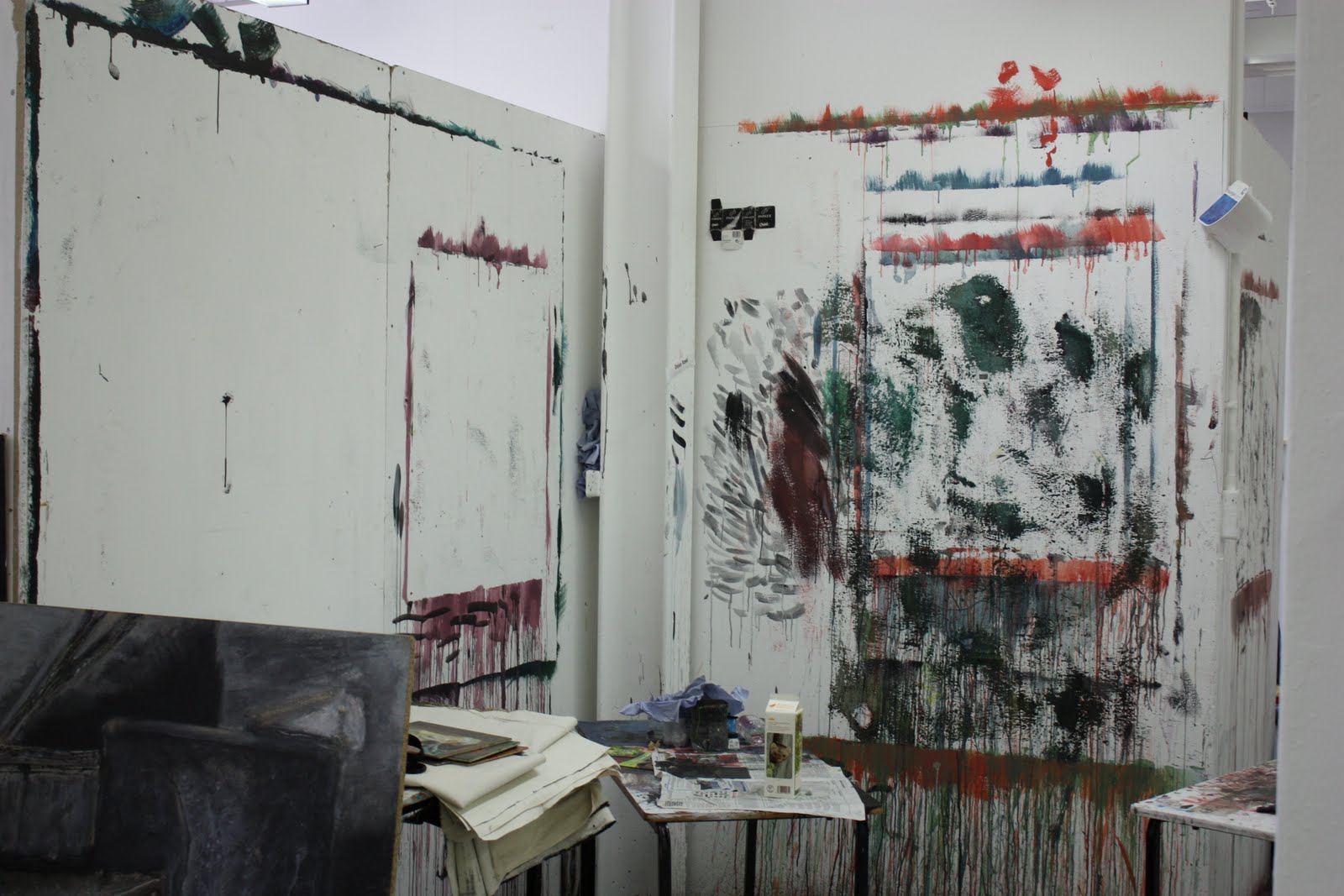
Oh, and here's my space, it's a mess, and you haven't seen the wall to the right of this shot, or the floor, that's where I actually do my pieces - next post will feature a lovely messy shot.


Definately my two favourite pieces up to now and the canvas thrown on the wall to the right is my next piece. It's quite adventurous, a good metre and a half + either way, with building and sky and portrait... Let's just see how it goes I guess.

By the way, yes I am messing you about, the layout of this post is different to the last, or most of them... Go me.

Tuesday, 30 March 2010

So I've been producing portraits again, Finally.

As always with my blog, start from the bottom first for the order in which these are shown - I like it that way, and it just gives you something to do other than blandly sifting down a page!


The third of my portraiture pieces for this semester, this was done on loose canvas (around 4"x4") with a house paint base coat, ink subject and ink and charcoal surround. I do like this piece very much.


This crazy looking man is my friend Mike. I wanted to see what my house paint colours would do, so went a bit silly really with this one. It's still a decent representation of him, however in the end I seemed to be more focussed on colour than accuracy! Oh well. This is painted completely in house paints on an 8"x4" piece of loose canvas, this picture showing around 6"x3"6' of it.


The first of my portraiture pieces this semester, this is a painting of my friend Catherine. I had to alter her a little as her face is so soft I just couldn't entice any imperfections or features out of it! So it doesn't look like her completely, but then again, I love my artistic licence. This piece is done on an 8"x5" piece of loose canvas (around 6"x4" shown here) and is painted wholly in house paints.

Lol, I was on 'tv'.

My teacher came upto me, and asked did I want to be on 'tv', I was hesitant at first, for obvious reason but then he said it was to help out some other students on the film course, so I was delighted to. Anyway, they wanted me to paint a piece in under 20 minutes whilst actually on one of their shows, aswell as being interviewed and explaining to them the work that I was creating! Marvellous challenge, I had fun, and came out with this sort of background piece of which I find quite interesting actually.
This piece was fun to do, captured here lay down on a table. I do want to look into backgrounds possibly for the pieces I'm going to blog about next, so hopefully this is a push in the right direction. It's a house paint piece, around 4"x4" I'd say, on loose canvas (I find loose canvas easier to work with than on a stretcher, I don't like the space behind the canvas on a stretcher and I like the canvas to be able to do its own thing).

Selling work?! On a main high street?! Wow!


This is my work above the 'Warhol' and 'Hockney' lettering - AS IF they would associate me with them, I'm all too flattered! I was very surprised my work would end up on this wall, which as you may be able to see I took from outside through a window - it's on one of the main streets in Preston, 1000's of people pass it each day! So yes, this is me, being very happy that my work is up for sale, not only that, it's up for sale in the best place ever! Whether it sels or not, my work has been out there, and shall continue to be from now on I should think!

Saturday, 7 November 2009


Poor picture of him lit up, but you get the picture. I became somewhat attached to him, though, and then shed a tear at his departure/throwing him in the bin.
This was my halloween effort, I thought he was pretty neat.
I've really enjoyed doing this piece. Light oil paint base, topped with indian ink, 'Parker Quink', bleach and white ink; 40x40" on boxed canvas - the first time, infact that I have properly used canvas.

Compressed charcoal pencil (soft) and compressed white pastel pencil (which hasn't come out very well - camera phone, what can I say?) around A2 in size.

5b pencil on paper, around A4 in size. This is a drawing of the face that would accompany the body below, I just wanted to focus in a little. There is meant to be a piece of which these drawings are studies for, however that is not yet available... Procrastination + Creative Block = Oh dear.

stick of charcoal on wallpaper, around A2 in size. Messed up the arm on the right hand side, even though it looks right, it certainly does not, from the picture.